You've been on a website and immediately felt something was off. You couldn't explain it — the logo was fine, the content was fine — but something made you click away.
That "something" isn't random. It's psychology. And the best websites are designed around it — whether they know it or not.
The 50-Millisecond Judgement
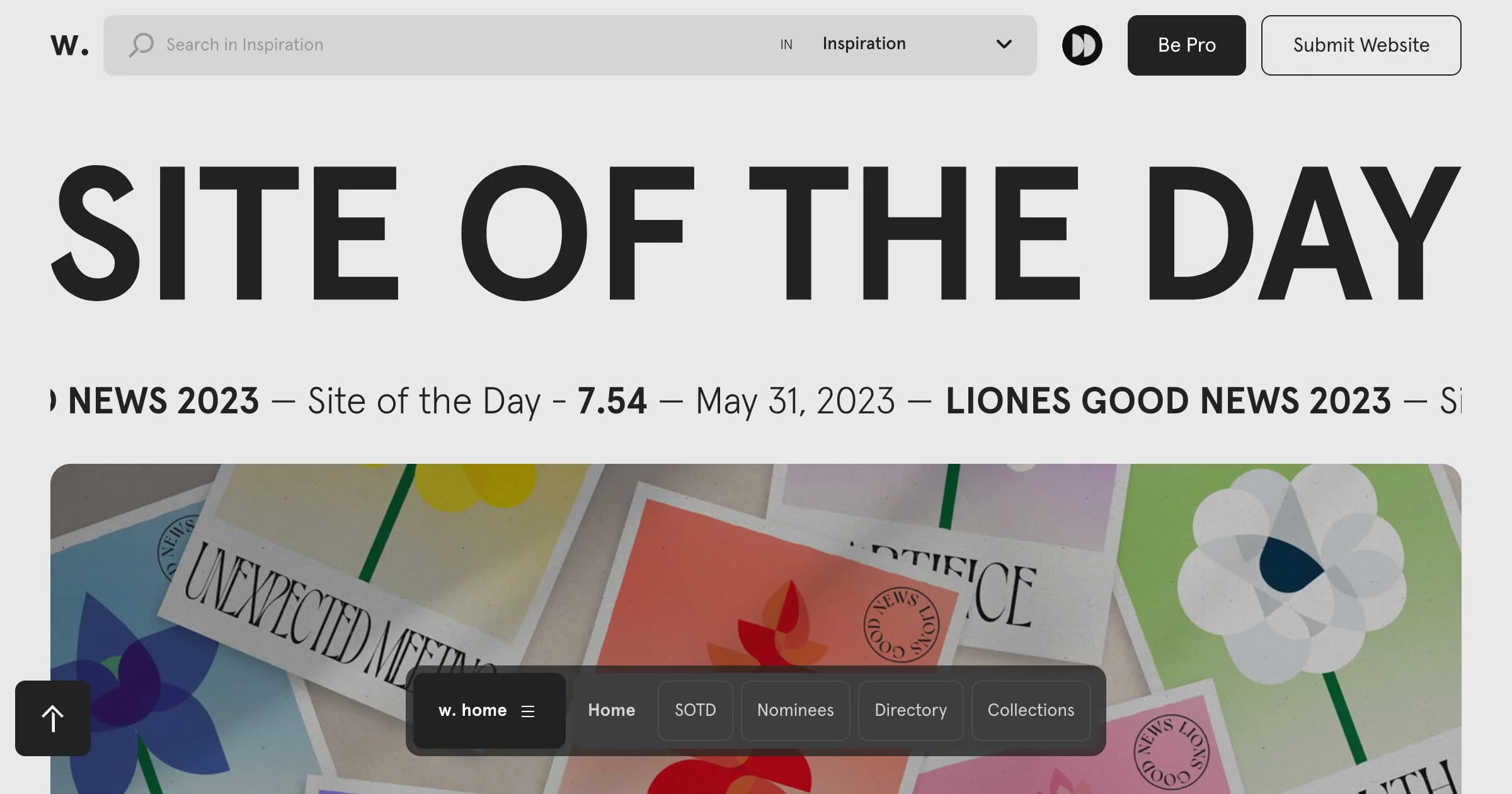
Researchers at Carleton University (Lindgaard et al., 2006) found that people form an opinion about a website in 50 milliseconds — that's 0.05 seconds. Not enough time to read a single word.
In that blink, visitors are processing:
- Visual complexity — is the page clean or cluttered?
- Colour harmony — do the colours feel intentional or random?
- Layout balance — does the page feel stable or chaotic?
This is why design isn't decoration. It's the first filter between "this business looks legit" and the back button.
The Trust Signals You Don't Notice
Stanford's Web Credibility Project (Fogg et al., 2003) studied what makes people trust or distrust websites. The findings still hold:
Design quality was the #1 factor. Not testimonials, not certifications — the visual design itself. 46.1% of participants cited design as their primary reason for trusting or distrusting a site.
What this means: you can have the best product in Malaysia, but if your website looks like it was built as an afterthought, visitors will assume your business is an afterthought too.
The specific trust signals that matter:
- Professional photography over stock photos (people can tell)
- Consistent typography — one or two fonts, used deliberately
- Whitespace — breathing room signals confidence, not emptiness
- Contact information visible — phone number, address, WhatsApp. If you're hiding, visitors wonder why
Hick's Law: Why Too Many Options Kill Conversions
Hick's Law states that the time it takes to make a decision increases with the number of choices. This is why restaurant menus with 200 items feel overwhelming, and why websites with 15 navigation links underperform ones with 5.
A classic study by Iyengar & Lepper (2000) at a grocery store found that a display of 6 jam varieties converted at 30%, while a display of 24 varieties converted at just 3%. Ten times worse — because of too many options.
Applied to web design:
- One clear CTA per page outperforms three competing buttons
- Simplified navigation keeps visitors focused instead of overwhelmed
- Progressive disclosure — show the essentials first, details on request
Every extra button, link, or option you add to a page is a potential exit point. The best-converting pages are ruthlessly simple.
The F-Pattern and How People Actually Read
Eye-tracking research by the Nielsen Norman Group consistently shows that people don't read web pages — they scan them in an F-pattern: across the top, then down the left side, with occasional horizontal scans.
This means:
- Your most important message belongs in the top-left area
- Headlines and subheadings get read; paragraphs get skimmed
- The first two words of every heading carry most of the weight
- Bullet points and bold text catch eyes; walls of text don't
If your key value proposition is buried in paragraph three, most visitors will never see it.
Colour Psychology — But Not the Way You Think
You've probably seen those infographics: "blue means trust, red means urgency, green means growth." The reality is more nuanced.
Research shows that colour associations are heavily influenced by context and culture. In Malaysia, red carries positive connotations (prosperity, celebration) that it doesn't carry in Western markets. Green is associated with Islam and nature. These cultural signals matter more than generic colour psychology charts.
What the research does consistently show:
- Contrast matters more than specific colours. A CTA button that stands out from the page background converts better — regardless of whether it's orange, green, or blue
- Colour consistency builds trust. Using your brand colours deliberately across every page signals professionalism
- Too many colours = visual noise. Two to three primary colours, used consistently, outperforms a rainbow
The goal isn't to pick the "right" colour. It's to use colour intentionally, consistently, and with enough contrast that your CTAs are unmissable.
Loading Speed Is a Design Decision
Google's research (2018) found that as page load time increases from 1 to 3 seconds, the probability of bounce increases by 32%. From 1 to 5 seconds? 90%.
Speed isn't just a technical concern — it's a design decision. Every heavy image, custom font, and animated element adds milliseconds. Those milliseconds compound into lost visitors.
The fastest-converting sites make deliberate trade-offs:
- Optimised images (WebP format, proper sizing) over massive hero photos
- System fonts or variable fonts over loading 4 Google Font families
- Lazy loading for below-the-fold content
- Minimal JavaScript — animations are nice, but not at the cost of speed
A beautiful site that loads in 5 seconds will always lose to a clean site that loads in 1 second.
Social Proof: The Shortcut to Trust
Cialdini's principle of social proof is well-established: people look to others' behaviour when making decisions. On websites, this translates to:
- Testimonials — real quotes from real clients, ideally with names and photos
- Client logos — even small businesses benefit from showing who they've worked with
- Numbers — "47 projects completed" or "serving businesses across Selangor" gives visitors a reference point
- Google reviews — embedding your actual review score is more credible than curated testimonials
The key is authenticity. Visitors have developed a strong radar for fake testimonials. One genuine review with a real name beats ten anonymous five-star quotes.
Putting It Together
Good web design isn't about following trends or making things pretty. It's about understanding how people process information, build trust, and make decisions — then designing for that reality.
The research points to a few clear principles:
- First impressions are visual — design quality is your first trust signal
- Simplicity converts — fewer options, clearer paths, less noise
- Speed is non-negotiable — every second of load time costs you visitors
- Cultural context matters — design for your actual audience, not a generic template
- Social proof accelerates trust — let your existing clients do the convincing
If your website isn't converting the way you'd like, the answer usually isn't more content or more features. It's better design — informed by how people actually think.
At Zedech Studio, we design websites grounded in these principles — clean, fast, and built to convert for Malaysian businesses. If your current site isn't pulling its weight, let's talk about what a redesign could look like.
Related reads: