Every year, design blogs publish "top 10 web design trends" lists full of things nobody actually uses. Glassmorphism! Neumorphism! 3D parallax everything!
Let's skip the hype and talk about what actually matters — trends that make websites work better for real businesses with real customers.
1. Speed Is the New Design
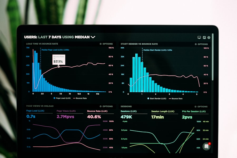
The most impactful "design trend" of 2026 isn't visual — it's performance. Google's Core Web Vitals are now a serious ranking factor, and users expect pages to load in under 2 seconds.
What this means in practice:
- Fewer hero videos, more optimised images
- System fonts over custom web fonts (or at least variable fonts)
- Less JavaScript, more server-side rendering
- Lazy loading everything below the fold
A beautiful site that takes 5 seconds to load loses to an okay site that loads instantly.
2. Editorial Layouts Over Card Grids
The "card grid" pattern dominated the last decade. Every site had the same 3-column grid of rounded rectangles. In 2026, the best sites are shifting toward editorial layouts — asymmetric, text-forward, with intentional whitespace.
Think magazine spreads, not Pinterest boards.
This works because:
- It creates visual hierarchy naturally
- It forces you to prioritise content
- It feels more premium and considered
- It stands out in a sea of template sites
3. Less UI, More Content
The best interfaces in 2026 get out of the way. Fewer buttons, less chrome, more breathing room. The content is the interface.
Practical examples:
- Navigation with 4-5 items, not 12
- Single-column layouts for content pages
- Large typography instead of small text with icons
- Whitespace as a design element, not wasted space
4. Dark Mode Done Right
Dark mode isn't new, but most implementations are still bad — pure black backgrounds, poor contrast, and colours that look muddy.
Good dark mode in 2026:
- Dark grey (
#1a1a1a) instead of pure black - Reduced white point (off-white text, not
#fff) - Colours adjusted for dark backgrounds (lighter, more saturated)
- Respects system preferences automatically
5. Motion With Purpose
Animation is everywhere, but purposeful motion is rare. The trend isn't "more animation" — it's using motion to communicate.
Good motion:
- Page transitions that show spatial relationships
- Loading states that reduce perceived wait time
- Scroll-triggered reveals that guide attention
- Micro-interactions on buttons and inputs
Bad motion:
- Parallax for the sake of parallax
- Everything bouncing on scroll
- Animations that delay access to content
- Motion that triggers on every visit, not just the first
6. Accessibility as Default
This isn't a trend — it's a baseline. But in 2026, more businesses are finally taking it seriously.
The minimum:
- Proper heading hierarchy
- Alt text on all images
- Keyboard navigable
- Sufficient colour contrast (4.5:1 minimum)
- Focus indicators visible
Not because of compliance (though that matters) — because accessible sites work better for everyone.
What This Means for Your Business
You don't need to chase every trend. But if your website was built more than 2-3 years ago, it's probably missing several of these fundamentals.
At Zedech Studio, we build with all of these baked in. Not as extras — as the foundation.