"The website looks fine."
That's the most dangerous sentence in business. Fine means forgettable. Fine means your competitor — with a sharper brand and better SEO — is eating your lunch while your site sits on page 3 of Google.
Let's fix that.
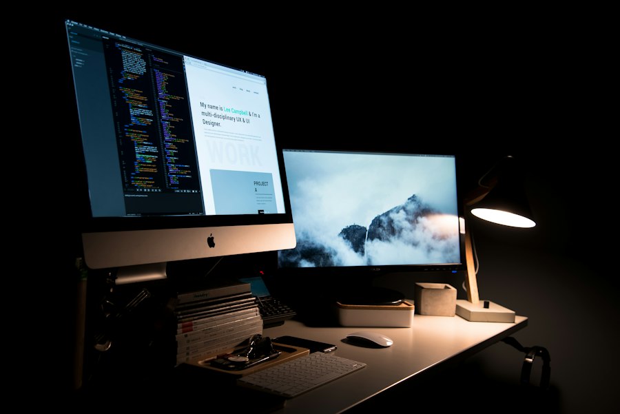
SEO: The Difference Between Found and Invisible
When someone in KL types "best web designer near me," do you show up? If not, you're losing customers every single day to someone who does.
Good SEO isn't just stuffing keywords into your About page. It's:
Speed. Google penalises slow sites. If yours takes more than 3 seconds to load, you're already losing 40% of visitors.
Mobile first. Over 70% of Malaysian internet traffic is mobile. If your site doesn't look perfect on a phone, Google notices — and so do your customers.
Structure. Headings, meta descriptions, alt text, internal links. Search engines need to understand your site, not just see it.
Local SEO. Google Business Profile, location pages, reviews. This is how neighbourhood businesses win against big brands.

Branding: The 3-Second Judgement
People decide whether to trust your website in about 3 seconds. Three. Seconds.
In that time, they're not reading your copy. They're feeling your brand. Does this look professional? Does this feel like someone I'd trust with my money?
A strong brand is:
Consistent. Same look across your website, social media, business cards, and WhatsApp profile pic. Inconsistency = amateur hour.
Intentional. Every font choice, colour, and image says something. Random choices send random signals.
Memorable. After leaving your site, can someone describe it? Or does it blend into the thousand other websites they've seen this week?

Brand Colours: Your Silent Salesperson
Colour isn't decoration. It's psychology. Before a visitor reads a single word, your colours have already told them who you are.
Blue — "Trust us. We're reliable." Banks, tech companies, healthcare.
Black — "We're premium." Luxury brands, high-end services, fashion.
Green — "We're growing." Sustainability, wellness, finance.
Orange — "We're friendly and energetic." Food, retail, startups.
Warm neutrals — "We're calm and refined." Design studios, architecture, consultancies.
How to Choose (Without Overthinking)
-
Who's your customer? A 25-year-old startup founder and a 55-year-old Datuk respond to very different palettes.
-
What do competitors use? If everyone in your industry uses blue, going orange makes you stand out. But standing out isn't always the goal — sometimes fitting in builds trust.
-
Pick one primary, one accent. Primary for trust and recognition. Accent for buttons and calls-to-action. That's it. Don't overcomplicate.
-
Test on a real page. A colour that looks beautiful in a Figma swatch can look terrible as a full-width header. Always test in context.

Putting It Together
SEO gets people to your door. Branding makes them walk in. Colours make them feel at home.
Skip any one of these, and you're leaving money on the table. Not in theory — in real ringgit, every single day.
At Zedech Studio, we build all three into every website from day one. Not as an afterthought. Not as an add-on. It's just how we work.